Dashboard Logo
-
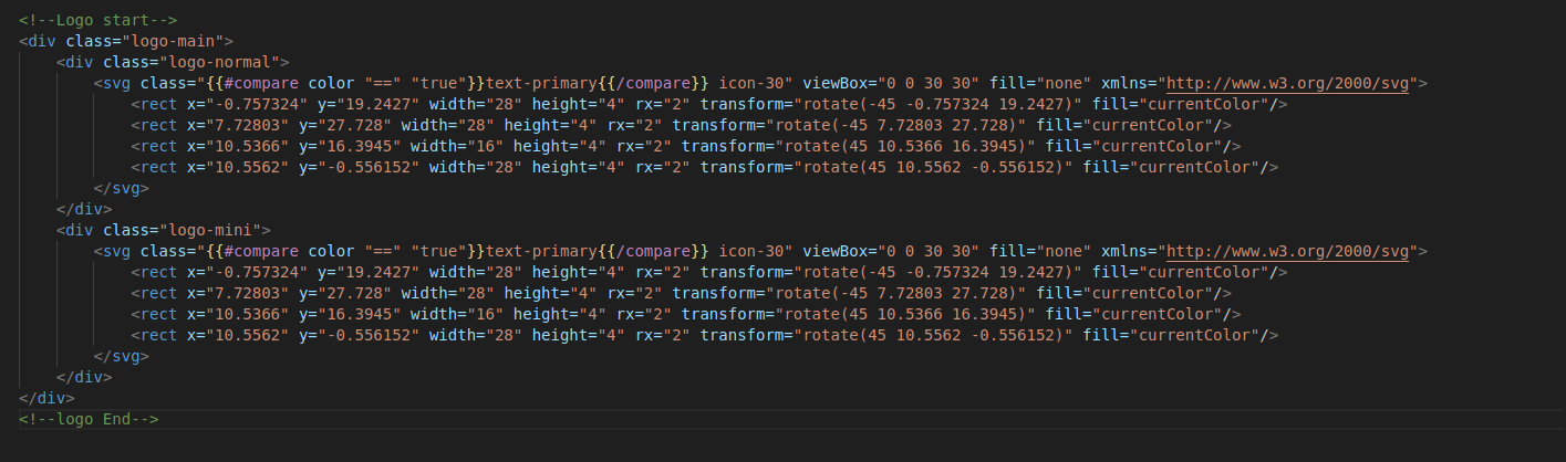
The Logo component can be found in the
templates/components/widgets/logo.hbs -
Then user has to call logo component wherever logo has to show eg.
{{>
                    components/widgets/logo }}
You can add a your own SVG icon to your
Website by replacing the svg code in
logo.hbs
You can add a image URL icon to your Website
instead of svg by replacing svg code with the following code and add
the image in the
assets/images/
folder:
<img
              src="images/your_logo_name.png"
              alt="logo">
Landing Page Logo
-
The logo used in landing page has svg code directly added inside
the header files located in
modules/landing-pages/components/partials/header-1.hbsandmodules/landing-pages/components/partials/header-1.hbs.
<svg
                class="icon-30 text-primary" width="30" viewBox="0 0 30 30"
                fill="none" xmlns="http://www.w3.org/2000/svg"> <rect
                x="-0.757324" y="19.2427" width="28" height="4" rx="2"
                transform="rotate(-45 -0.757324 19.2427)"
                fill="currentColor"></rect> <rect x="7.72803"
                y="27.728" width="28" height="4" rx="2" transform="rotate(-45
                7.72803 27.728)" fill="currentColor"></rect>
                <rect x="10.5366" y="16.3945" width="16" height="4" rx="2"
                transform="rotate(45 10.5366 16.3945)"
                fill="currentColor"></rect> <rect x="10.5562"
                y="-0.556152" width="28" height="4" rx="2" transform="rotate(45
                10.5562 -0.556152)" fill="currentColor"></rect>
</svg>{{>
components/widget/logo }}
Note:
Make sure to pass the appropriate props for the color or dark logo
according to your need. For ex:
{{>
                  components/widget/logo color="true"}}
for primary colored logo
{>
components/widget/logo color="true"}}