


60+
Introducing all new Sofbox
We have re-imagined Sofbox from bottom up. Its fresh, modern and more advanced.
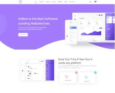


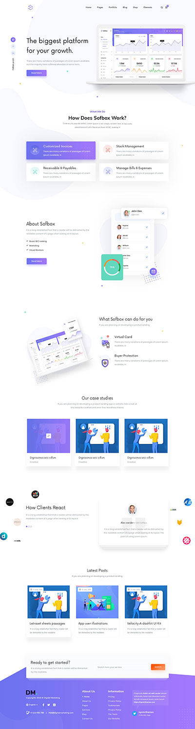
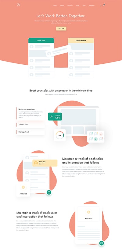


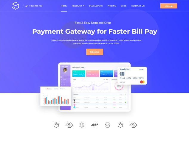


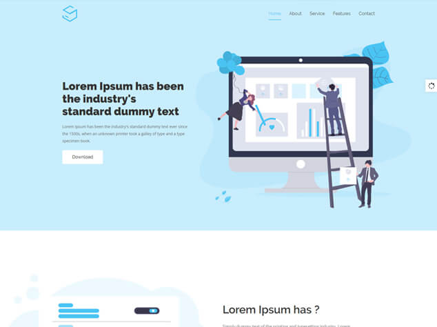
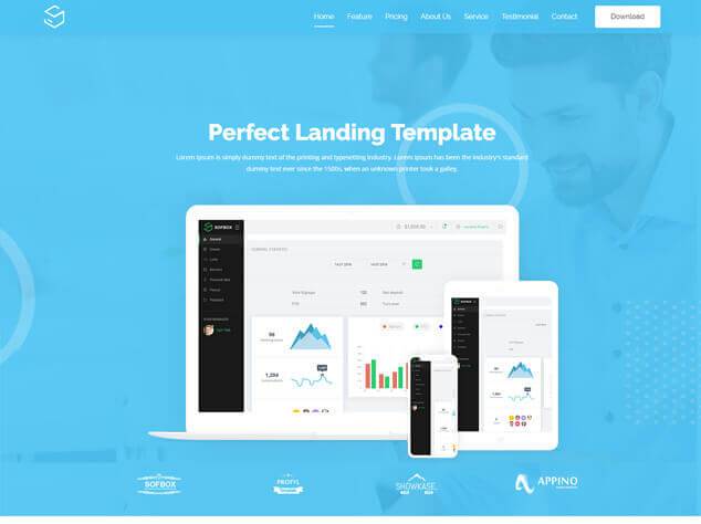
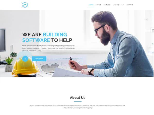
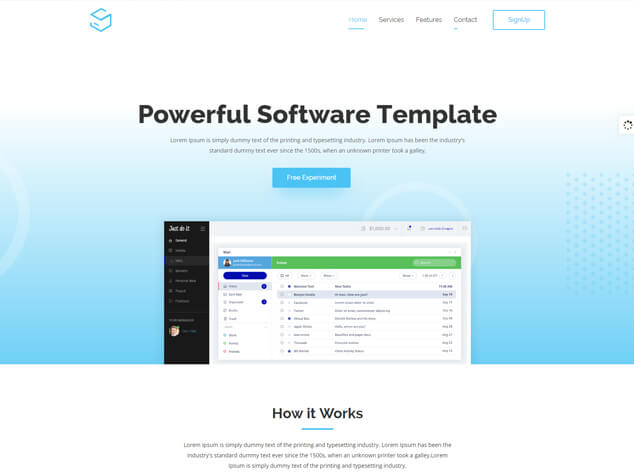
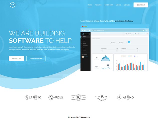
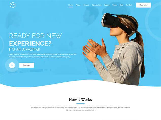
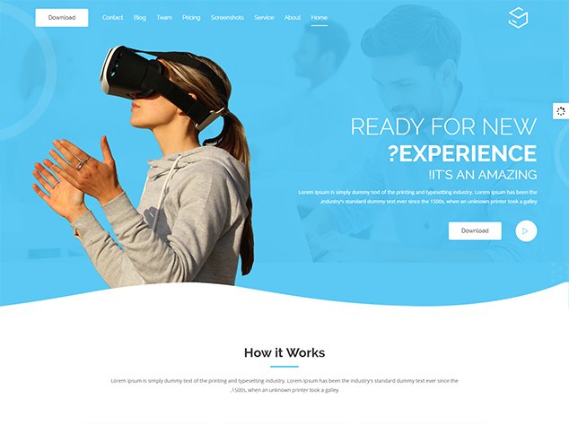
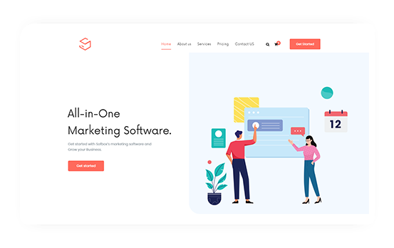
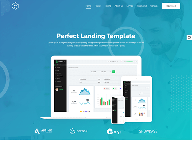
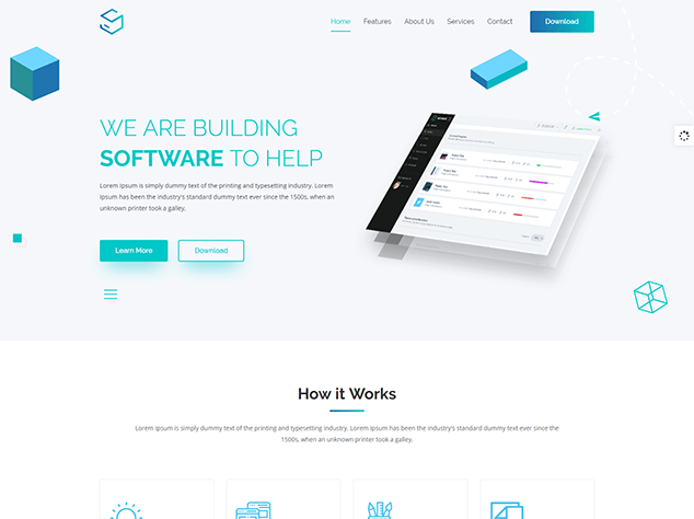
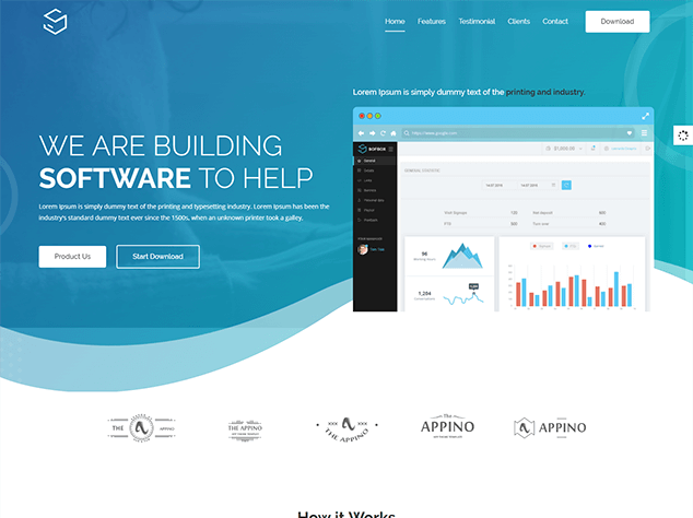
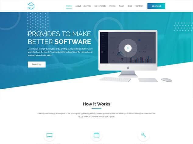
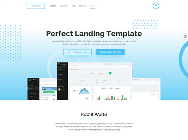
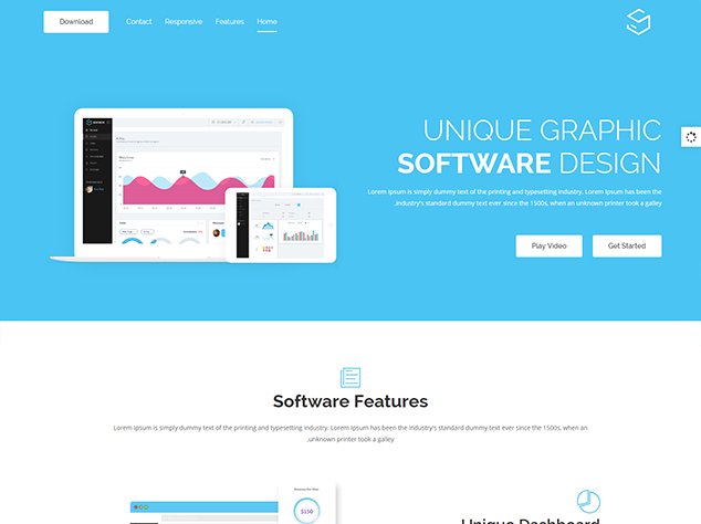
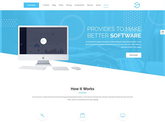
Main Gradient Layout 1
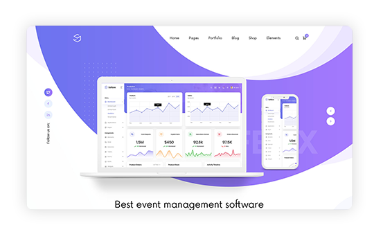
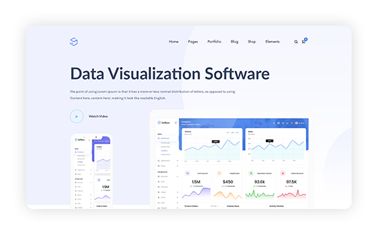
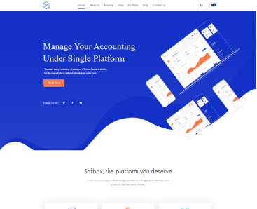
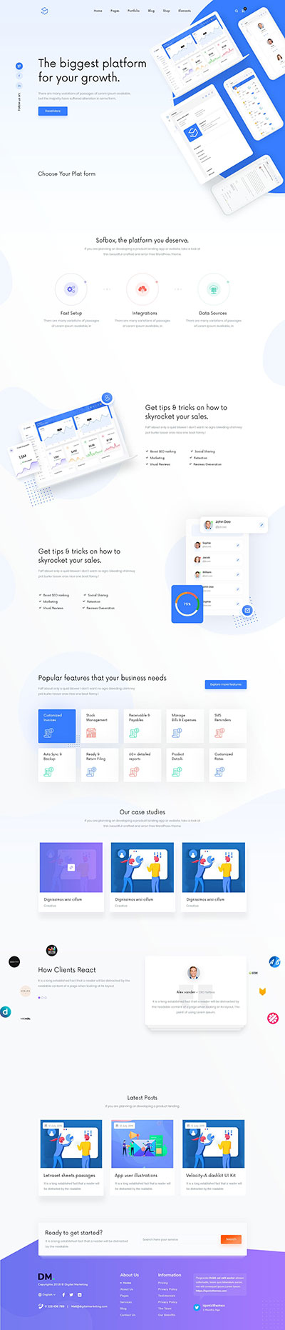
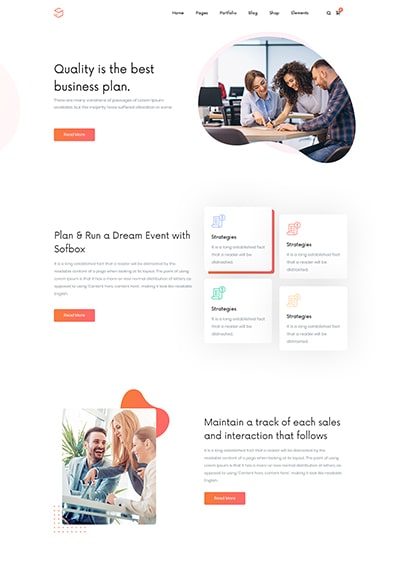
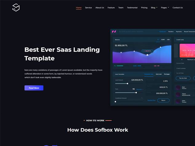
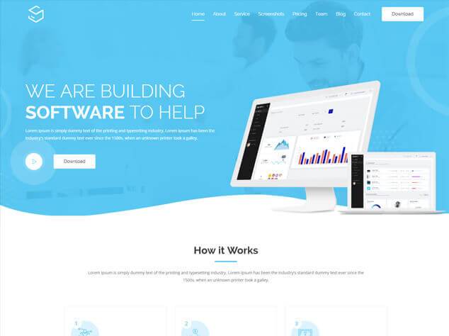
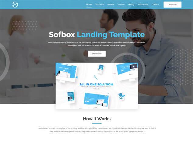
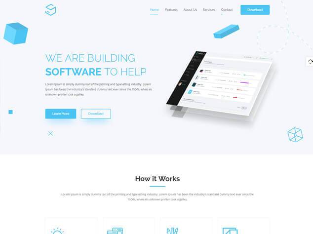
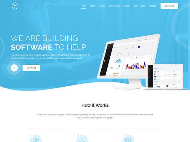
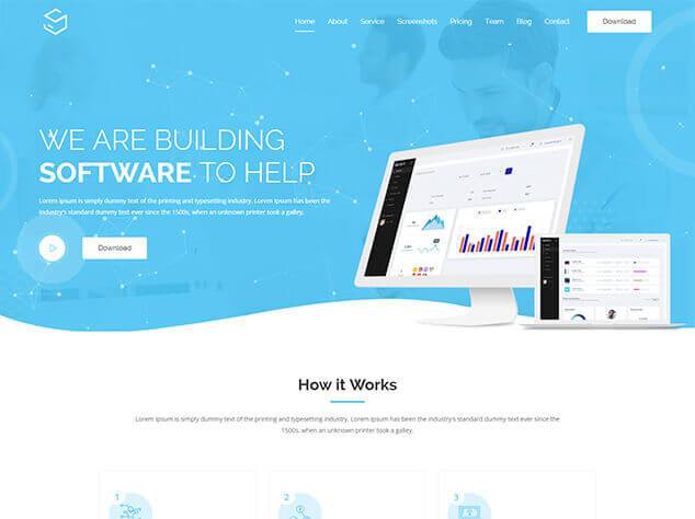
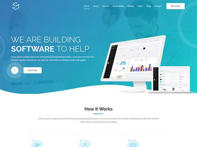
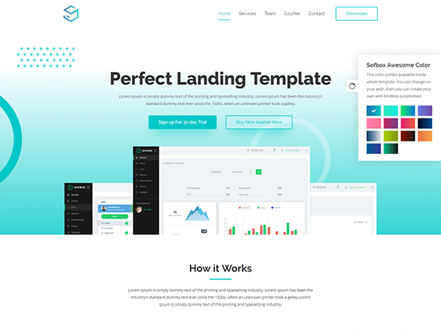
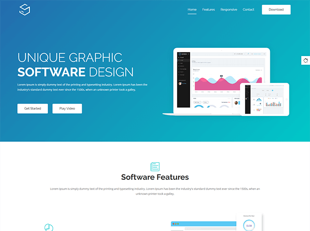
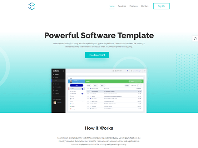
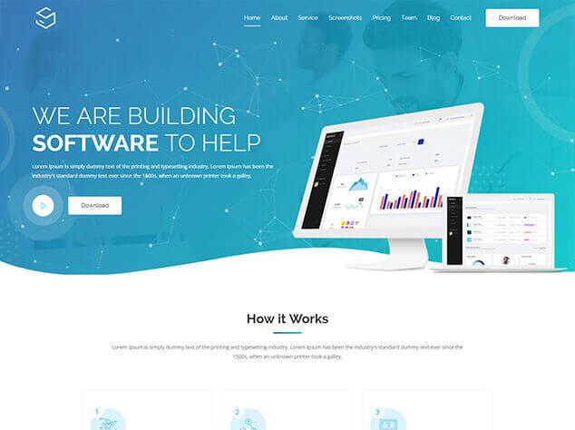
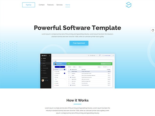
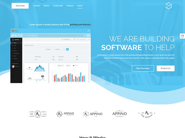
Main Gradient Layout 2
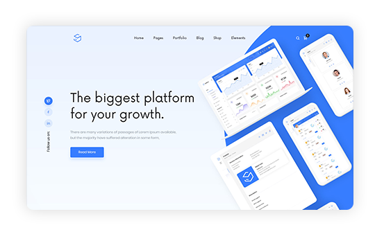
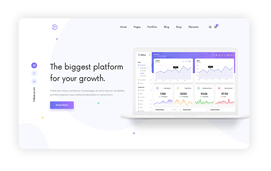
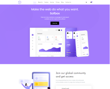
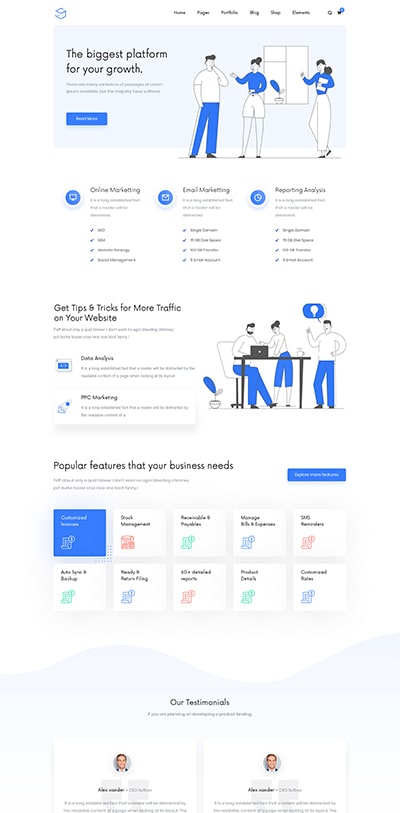
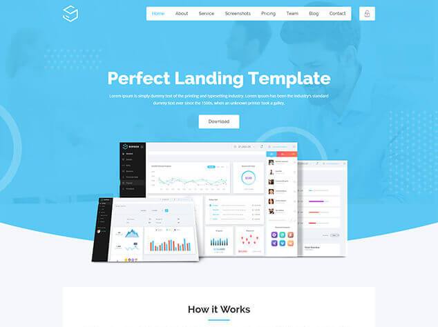
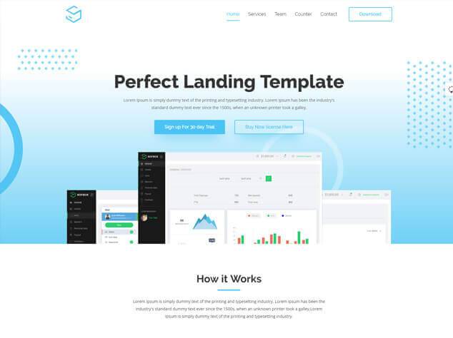
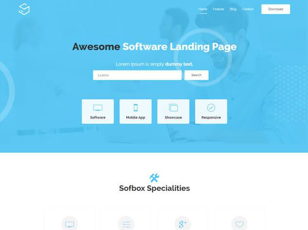
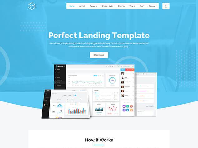
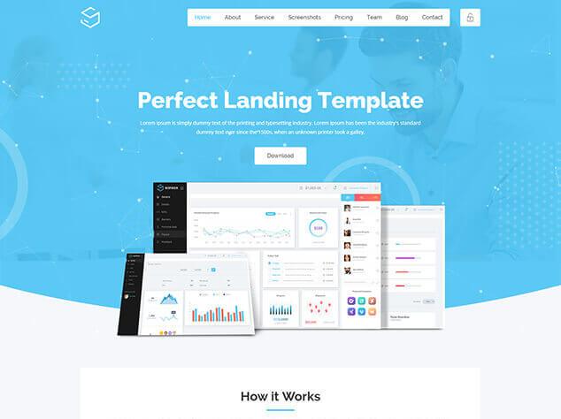
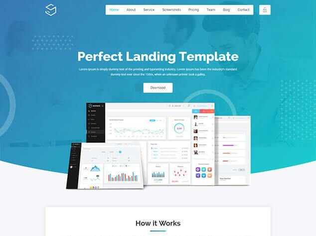
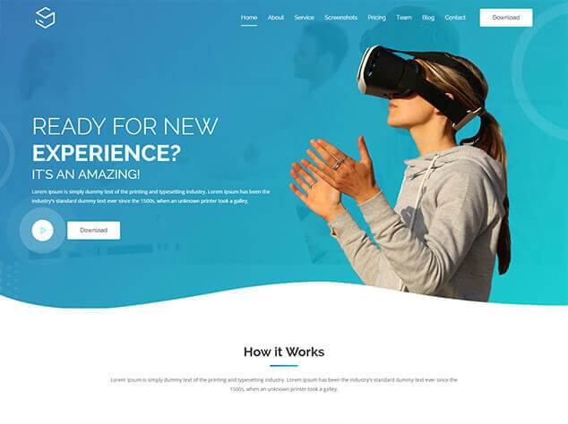
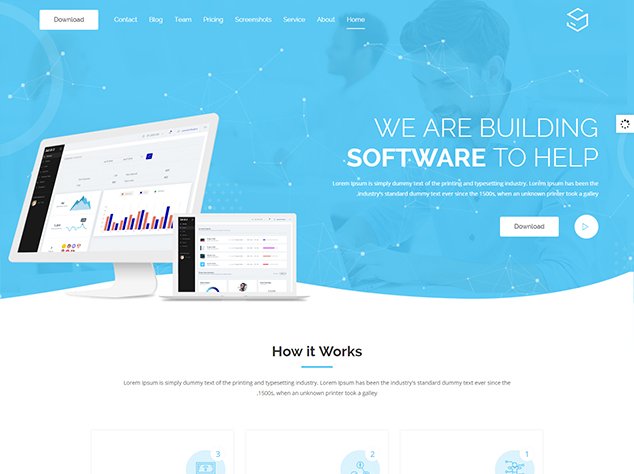
Main Gradient Layout 3
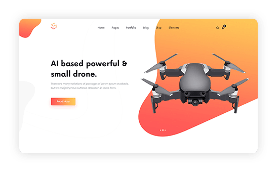
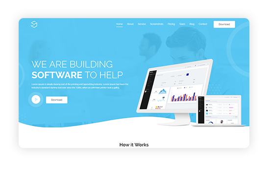
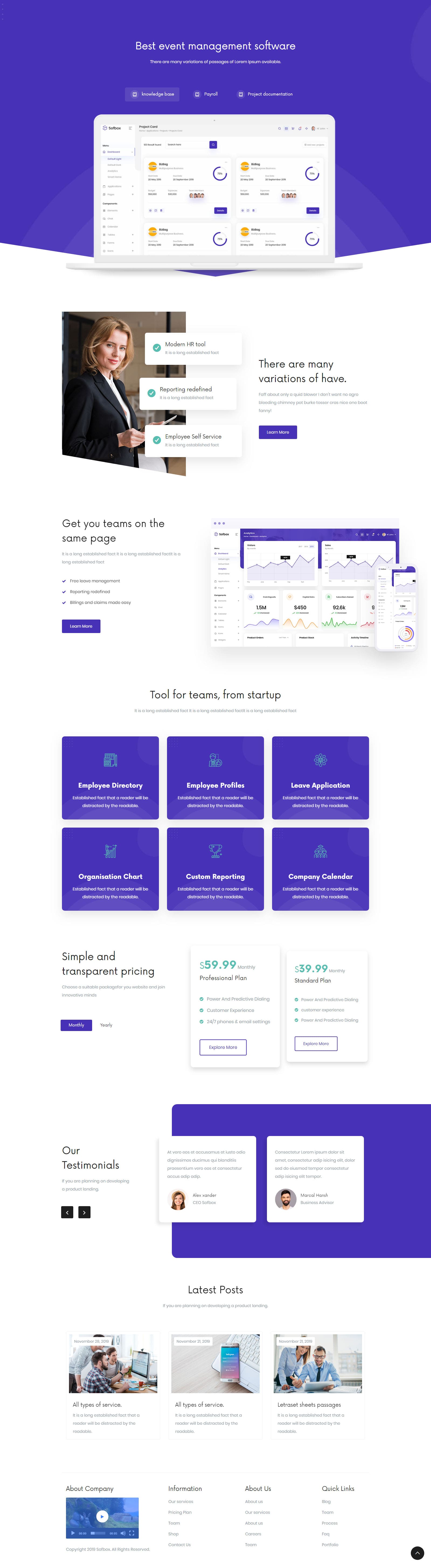
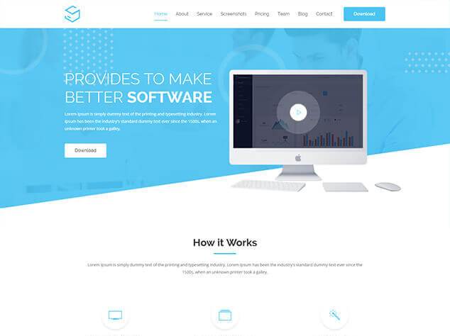
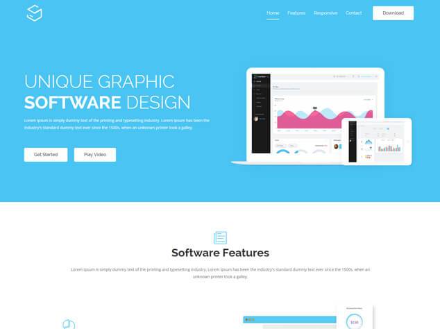
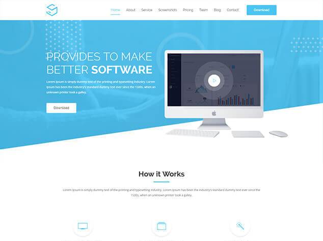
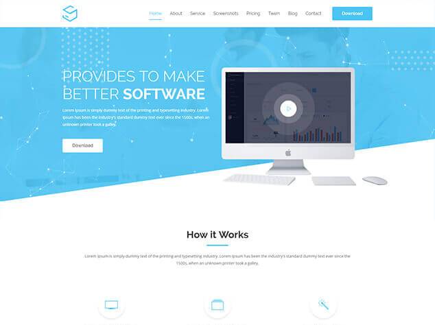
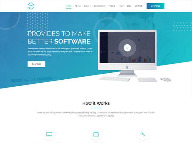
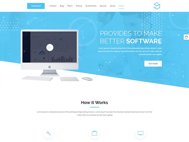
Main Gradient Layout 4
Main Gradient Layout 5
Main Gradient Layout 6
Main Gradient Layout 7
Main Gradient Layout 8
Main Gradient Layout 9
Main Gradient Layout 10
Main Gradient Layout 11
Main Gradient Layout 12
Main Gradient Layout 13
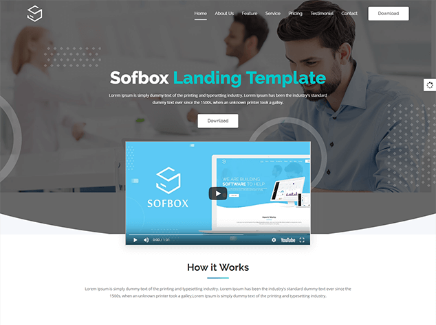
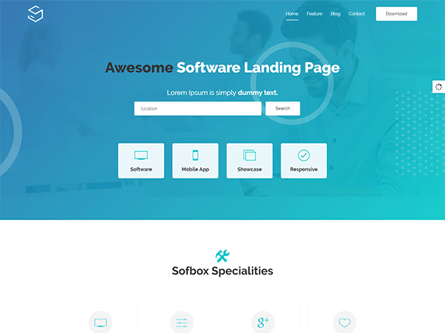
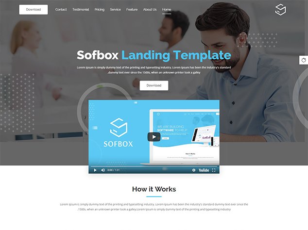
Gradient Video Layout 1
Gradient Video Layout 2
Gradient Video Layout 3
Gradient Particles Layout 1

Gradient Particles Layout 2

Gradient Particles Layout 3
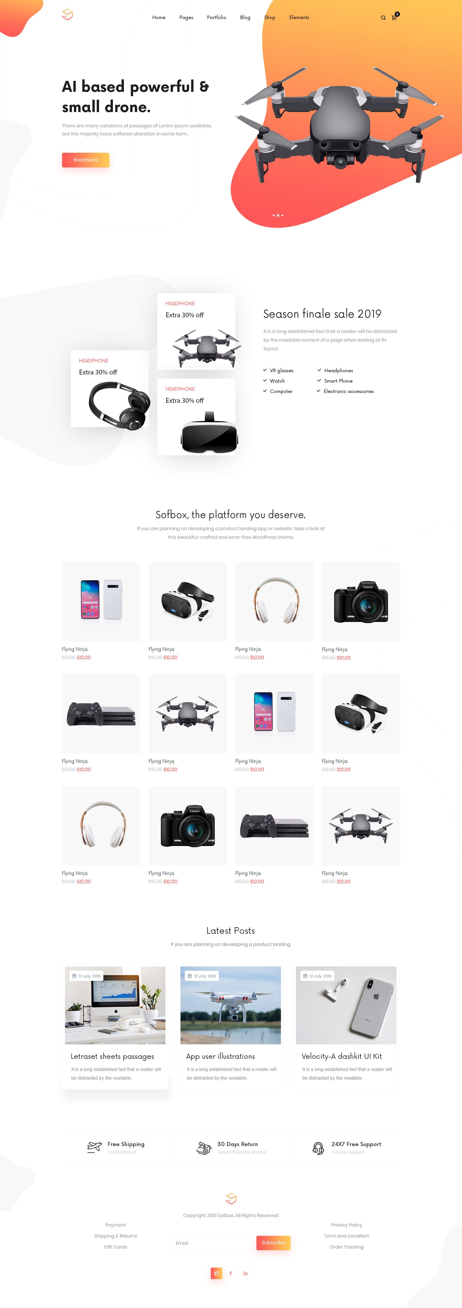
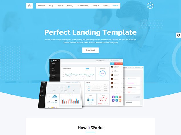
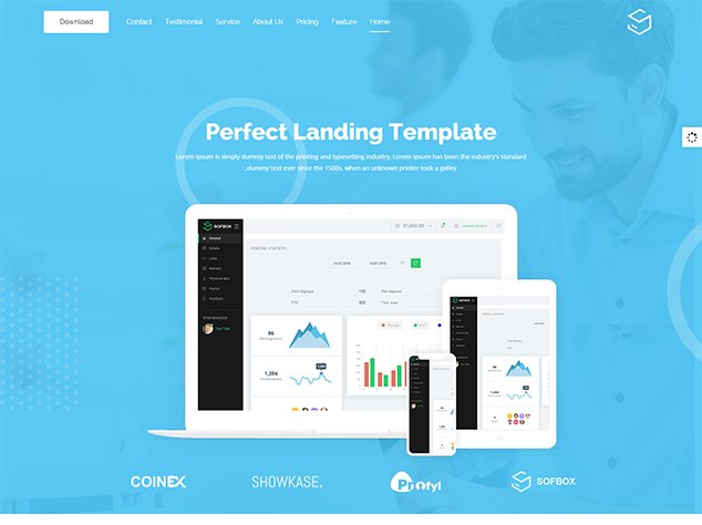
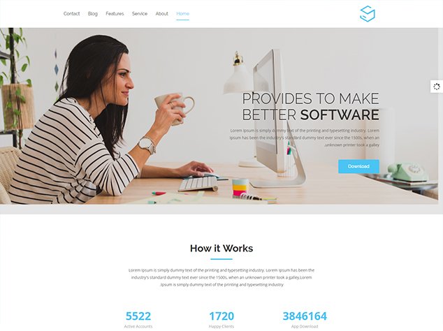
Product Landing Page
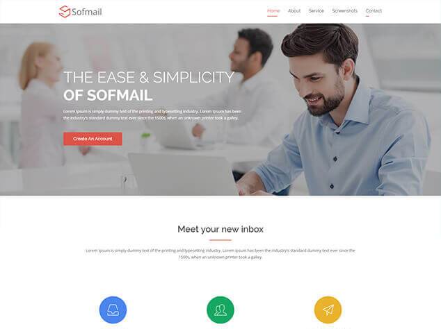
Gmail Style
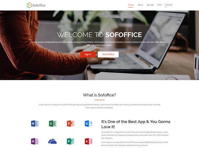
Office Style
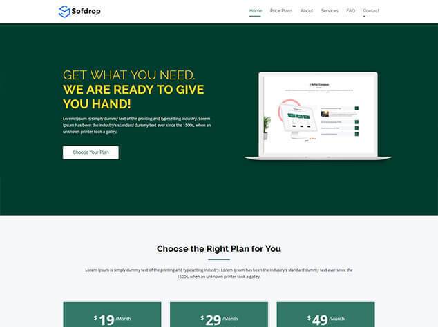
Dropbox Style
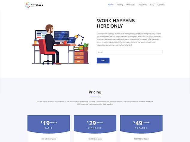
Slack Style
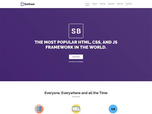
Bootstrap Style
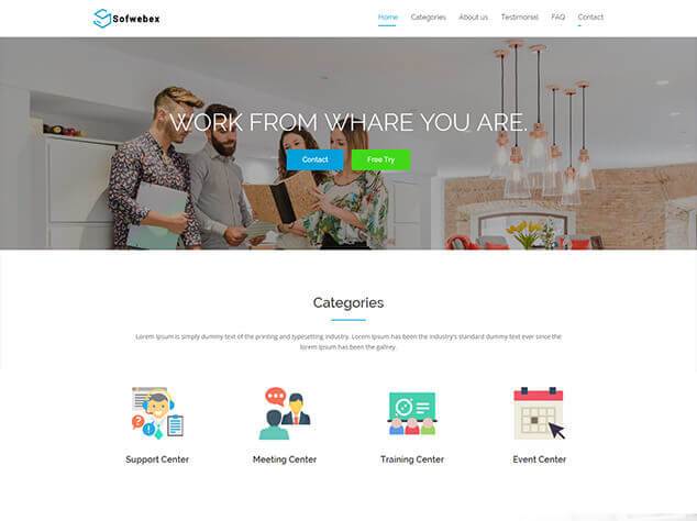
Webex Style

Coinbase Style
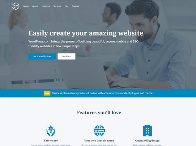
Wordpress
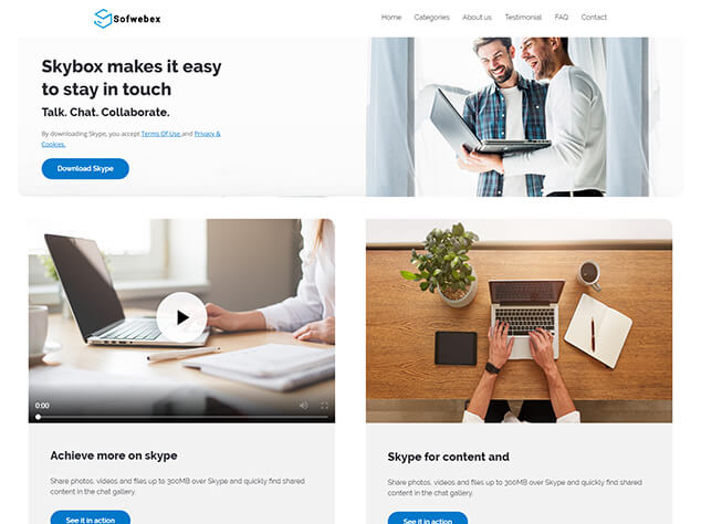
Skype
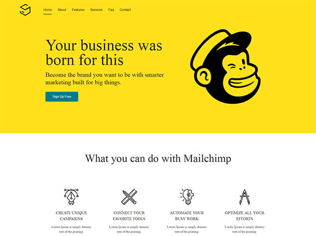
Mailchimp
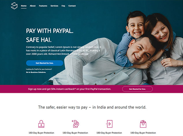
Paypal
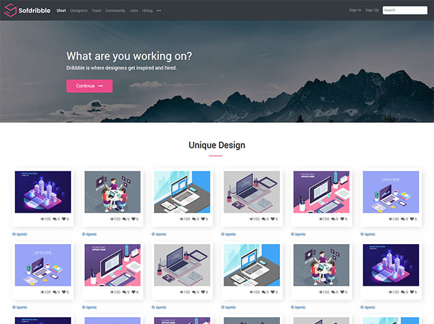
Sofdribble
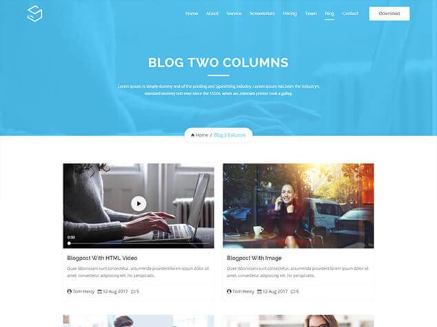
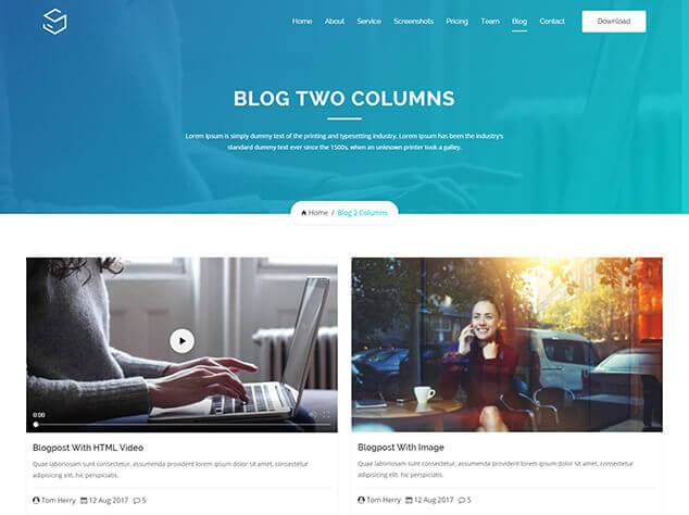
Blog 2 Columns
Blog 2 Full Columns
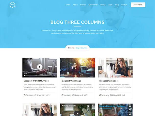
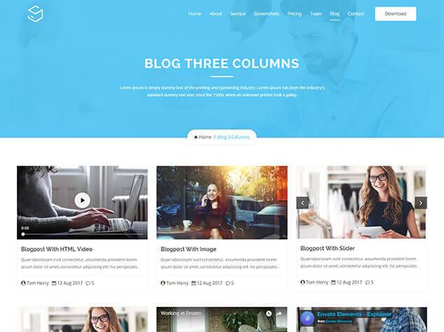
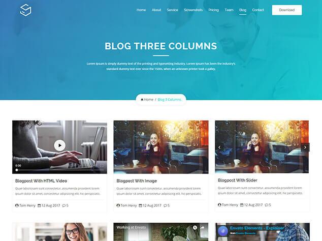
Blog 3 Columns
Blog 3 Full Columns
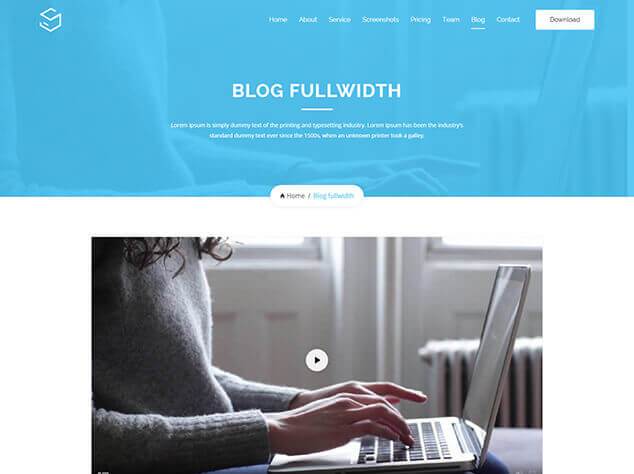
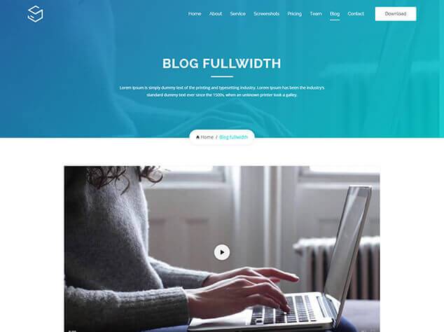
Blog FullWidth
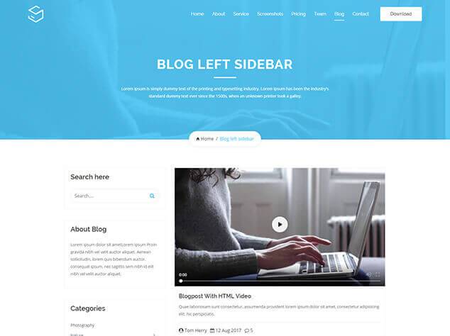
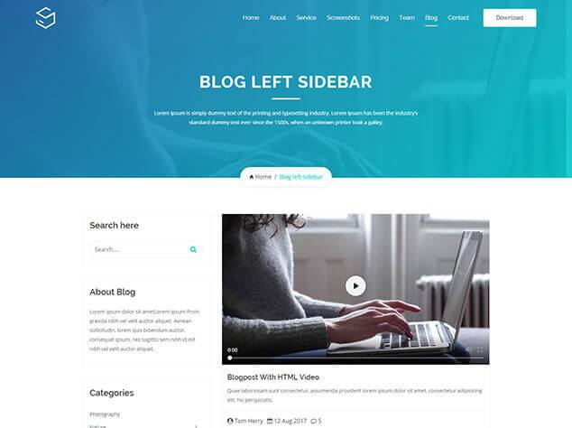
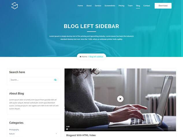
Blog Left Sidebar

Blog Full Left Sidebar
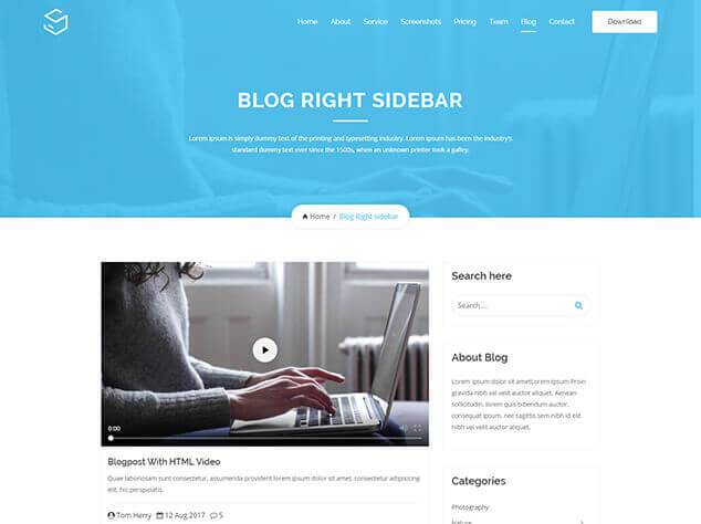
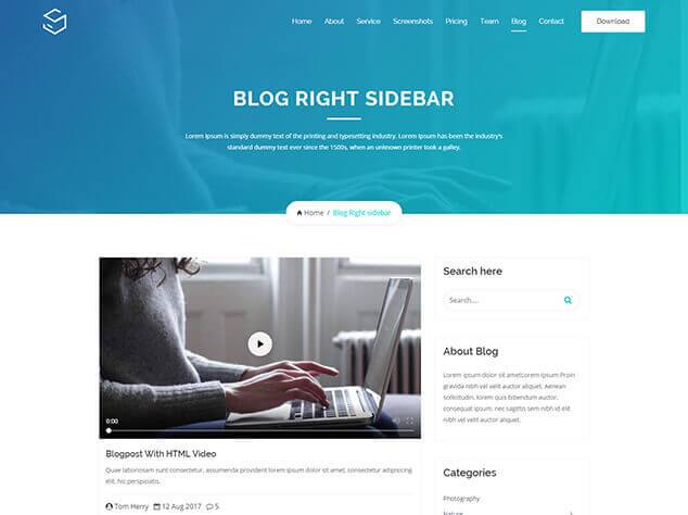
Blog Right Sidebar
Blog Full Right Sidebar
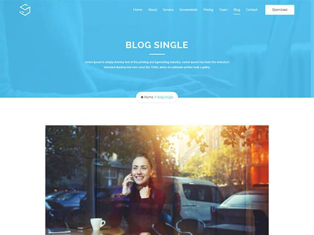
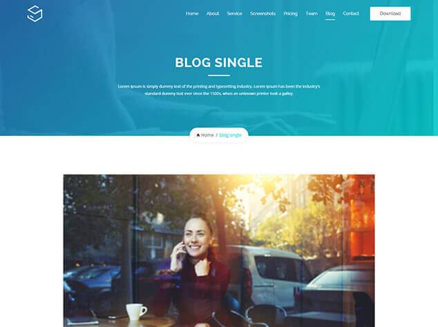
Blog Single
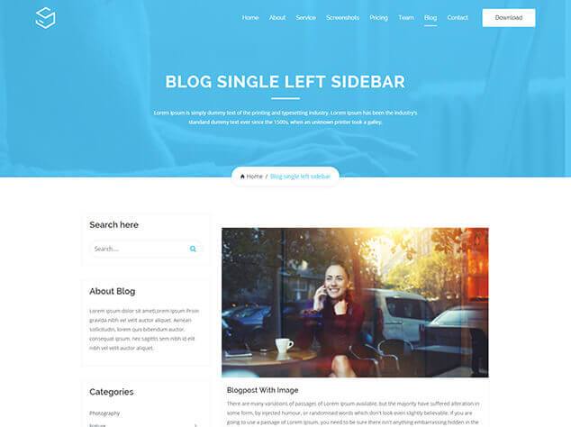
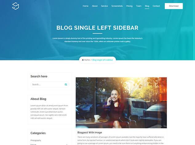
Blog Single Left Sidebar
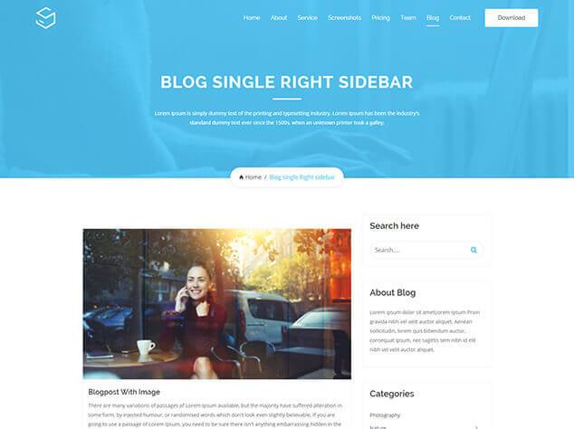
Blog Single Right Sidebar
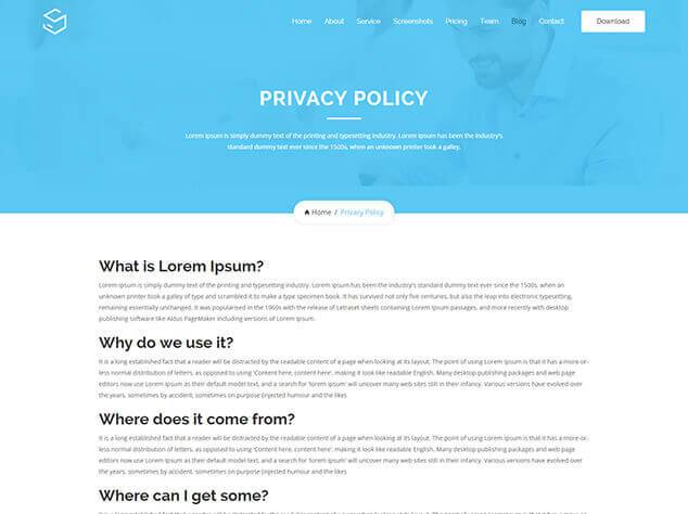
Privacy Policy
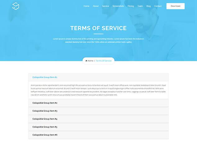
Terms Of Services
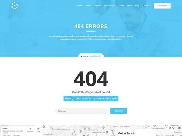
404 Errors
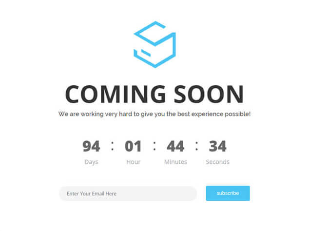
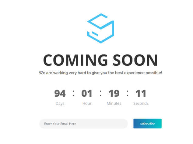
Cooming Soon
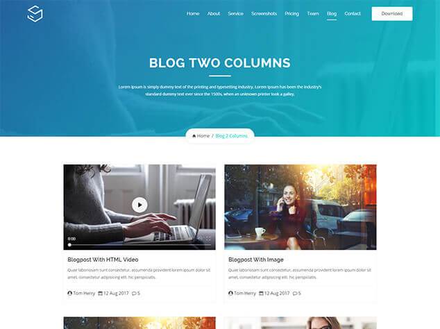
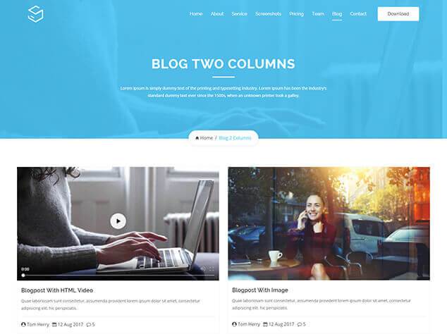
Blog 2 Columns
Blog 2 Full Columns
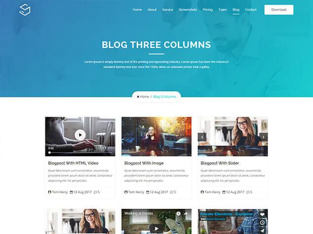
Blog 3 Columns
Blog 3 Full Columns
Blog FullWidth
Blog Left Sidebar
Blog Full Left Sidebar
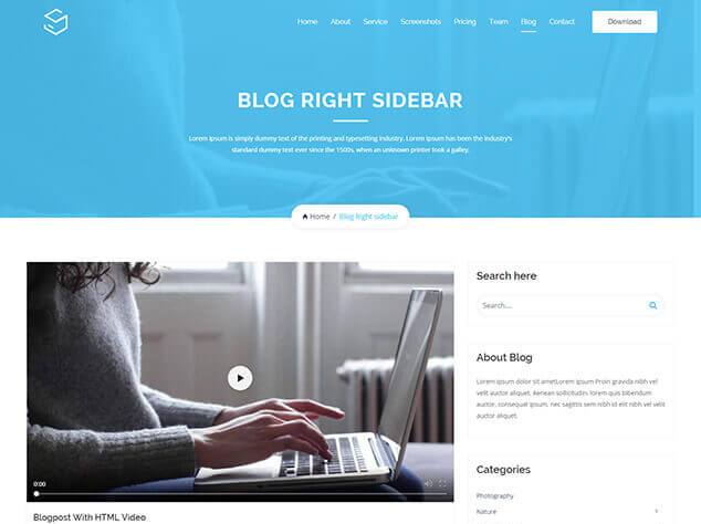
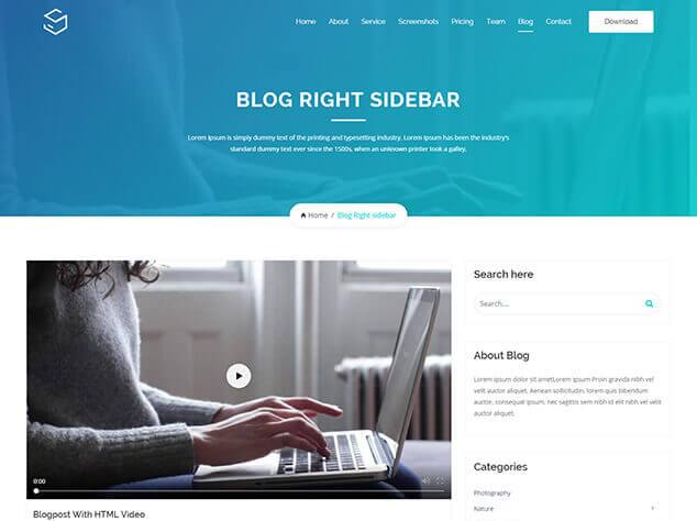
Blog Right Sidebar
Blog Full Right Sidebar
Blog Single
Blog Single Left Sidebar
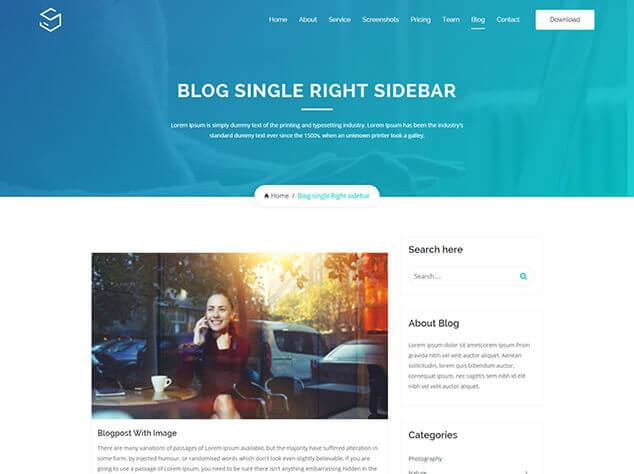
Blog Single Right Sidebar
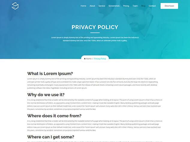
Privacy Policy
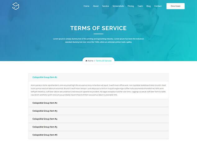
Terms Of Services
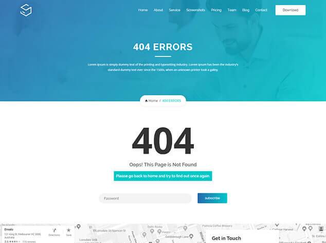
404 Errors
Cooming Soon

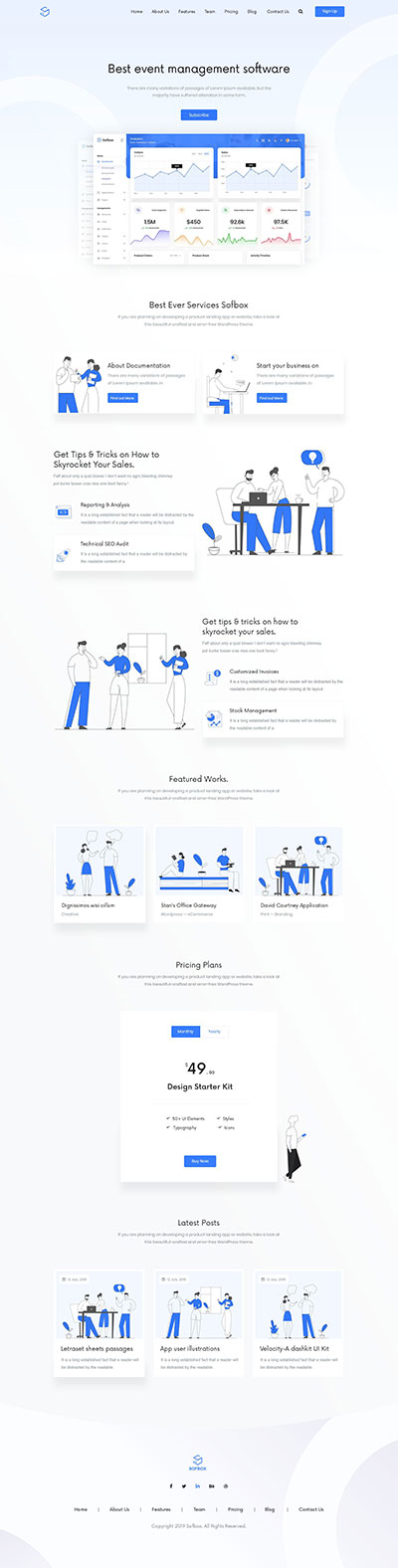
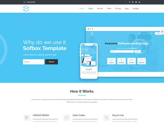
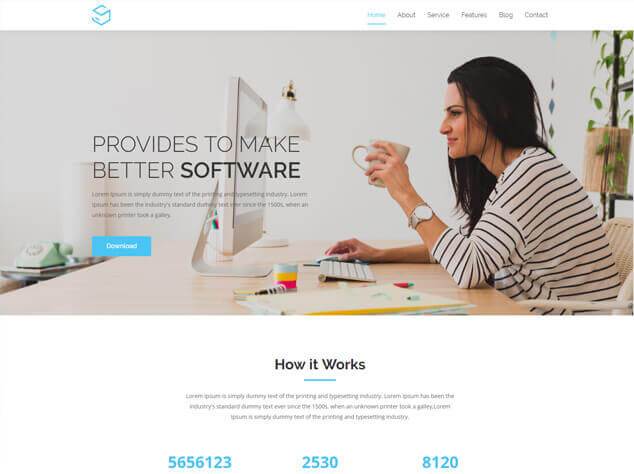
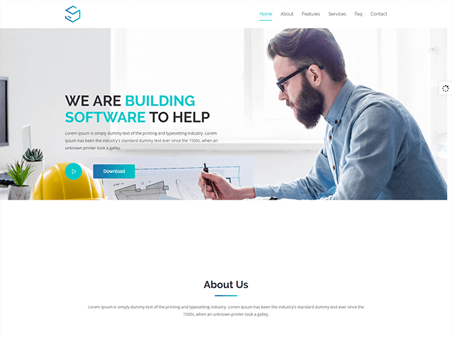
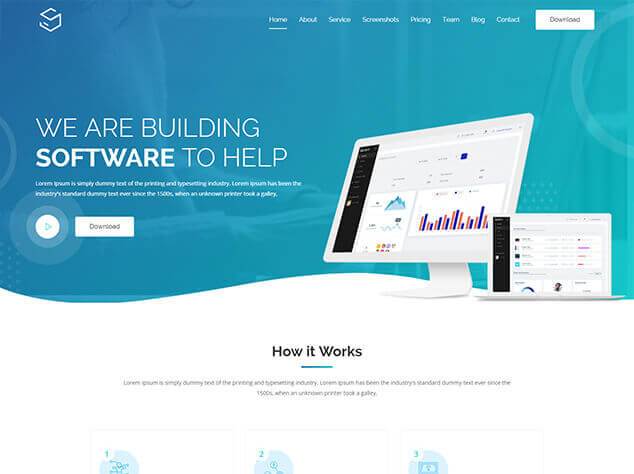
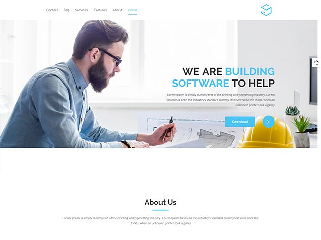
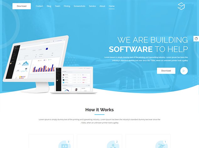
Main Layout 1
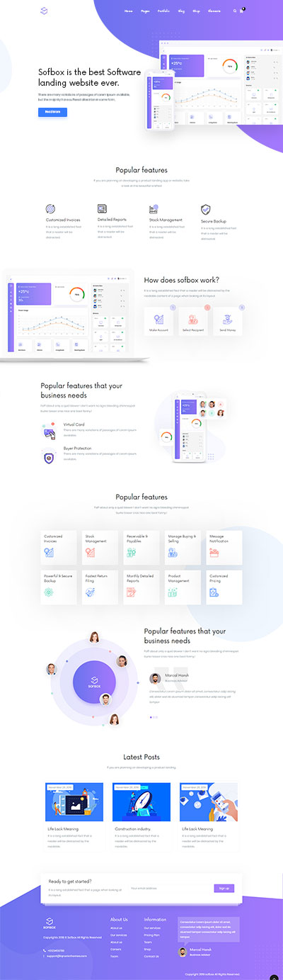
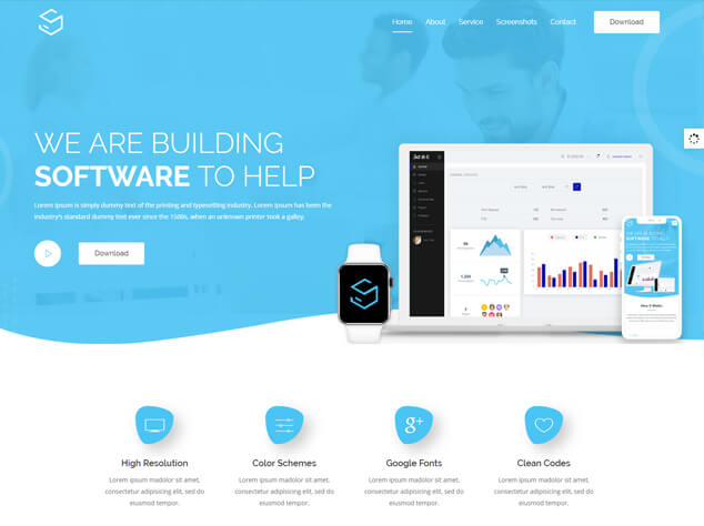
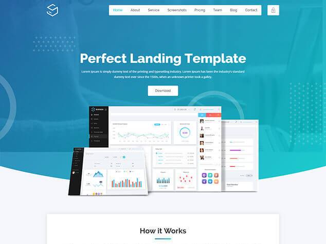
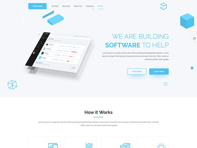
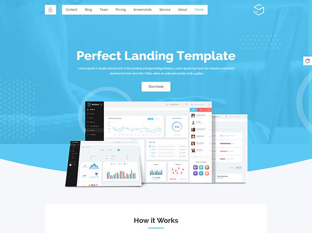
Main Layout 2

Main Layout 3
Main Layout 4
Main Layout 5
Main Layout 6
Main Layout 7
Main Layout 8
Main Layout 9

Main Layout 10
Main Layout 11
Main Layout 12
Video Layout 1
Video Layout 2
Video Layout 3
Video Layout 4
Particles Layout 1

Particles Layout 2
Particles Layout 3